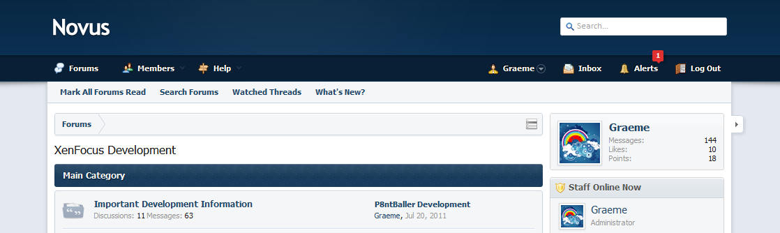
Novus - Sneak Peak and Development

IMHO this style would be utterly perfect if the bottom bar in this image was added onto this style:

http://dl.dropbox.com/u/18660955/xf-nav.png

I know you can use the dropbown from the menu, and I know it's possible to add the bar myself, but I'm no designer and I don't have much imagination and I wouldn't want to ruin it, but would be nice to have an option to turn it into this way.
 
We thought it was best to remove it to save vertical space. The bar also appears on pages which don't have sub navigation links, so we weren't big fans to be honest. :p You're more than welcome to add it back in if you like..
 
We thought it was best to remove it to save vertical space. The bar also appears on pages which don't have sub navigation links, so we weren't big fans to be honest. :p You're more than welcome to add it back in if you like..

I find people don't notice the extra options, not unless know it's there if you get what I mean. Where was it before you decided to remove it?
 
I've added a copy of Novus with the bar to the Novus forum. You can download it there.

Looks like:
lBatq.png
 
Wow..much nicer now. Thanks Graeme.. man I'm so close to pulling the trigger on this one.. but first i must know..what skin is next on the list? lol..
 
Do you ever plan on doing the nice clean squares like a few other of your themes on it. I know once Ehren commented that he was going to re-do the skins like this:

ww.jpg
 
I think you guys need to choose a different image for the member card. It doesn't look right IMHO. One of the first things I'll be doing when it goes live on my community is to replace the member card background with the default XenForo one :)
 
Back
Top