Novus - Sneak Peak and Development

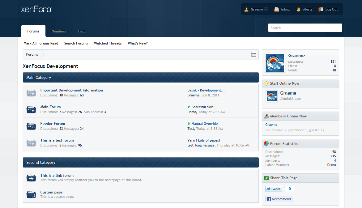
A bit late to the party here, but my preference is for image #3.

I prefer the distinct border between the dark header & the light main forum, with the tab being the only thing popping up into the dark. The skin that uses all dark for the BG (#2) makes the tab look like an odd appendage to me. The skin that extends the dark header further down (#1), over emphasizes the curve on the lower portion of the tab and the corresponding rounded corner of the forum bit. Additionally, there is a bit more space between the search box and the user controls on #3. The others feel scrunched up to me.

This one gets my vote. :)
tWaYa.png
 
Sounds good. I am returning home from London tomorrow and I'll try to get this skin released then. At the very least I'll put a public preview and you can all make comments before I release a final version :D.
 
Sounds good. I am returning home from London tomorrow and I'll try to get this skin released then. At the very least I'll put a public preview and you can all make comments before I release a final version :D.

Can't wait Graeme. I check everyday for it.
 
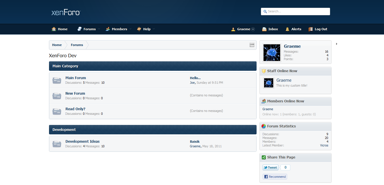
Getting there. This is what the header is like now. The submenu is now in a dropdown (the arrows go white when you hover over the menu item). Also, you'll notice the little arrow on the right (placeholder) that allows you to minimize and maximize the sidebar.

FGZ5A.png


We're getting there :D
 
Hopefully this gets finished soon - can't make the switch from vBulletin to XenForo without this skin. :(

Also, I think that the skin looked much better with a wrapper. :eek:
 
Graeme's currently moving to London, so he'll be mostly offline until he's settled in. I'm sure he's working on it as much as possible though. :)
 
Back
Top