You are using an out of date browser. It may not display this or other websites correctly.
You should upgrade or use an alternative browser.
You should upgrade or use an alternative browser.
Novus - Sneak Peak and Development
- Thread starter Graeme
- Start date


Graeme
Active Member
- Messages
- 439
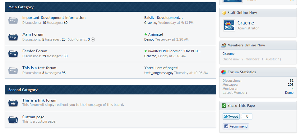
Looks good, I suggest adding a gradient effect like you had before for the category headers. I like the pattern but the gradient effect is needed IMO because it seems kind of flat right now.
Here you go!


- Messages
- 22
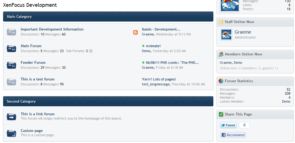
That looks great! However the one thing that bothers me is the very IPB look. Maybe try and make the category headers more rounded on the bottom? Like what the current theme here is. Just something to distinguish it from IPB themes... Just a suggestion though, as I seem to prefer the separated look more than the one you have shown  Looks great all the same though!
Graeme
Active Member
- Messages
- 439
That looks great! However the one thing that bothers me is the very IPB look. Maybe try and make the category headers more rounded on the bottom? Like what the current theme here is. Just something to distinguish it from IPB themes... Just a suggestion though, as I seem to prefer the separated look more than the one you have shown
That does look good

- Messages
- 280
- Website
- fluxoid.com
Looks great!
- Messages
- 22
Not sure right now, I'll let you know if I think of anything later... I really like the way this theme separates the replys with the blue box outline... And I also like the way the user info is displayed in this theme, so it's tough to think of something else
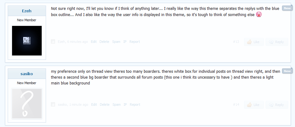
my preference only on thread view theres too many boarders. theres white box for individual posts on thread view right, and then theres a second blue bg boarder that surrounds all forum posts (this one i think its uncessary to have ) and then theres a light main blue background
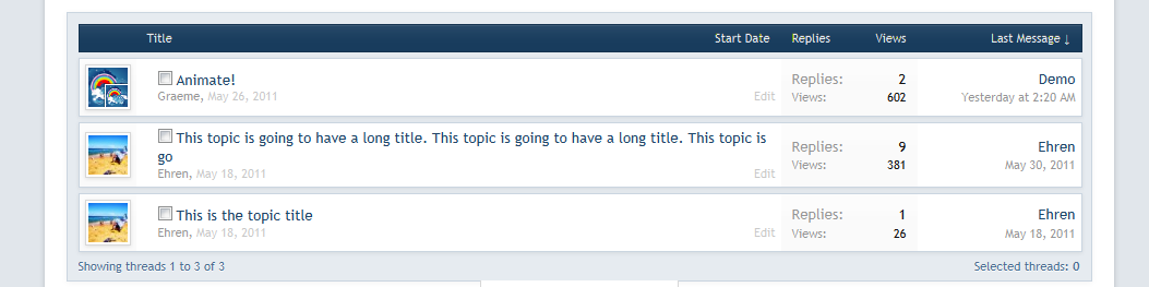
perhaps u could try adding gradient background instead of the white bg for threadlistI was actually testing that out with topics before, but wasn't sure if it would look good with many topics.
E.g. (this is just to show you what it would look like)
Graeme
Active Member
- Messages
- 439
my preference only on thread view theres too many boarders. theres white box for individual posts on thread view right, and then theres a second blue bg boarder that surrounds all forum posts (this one i think its uncessary to have ) and then theres a light main blue background
I see your point. It's super easy to remove the second border + background. It can be done in literally 10 seconds.
Example:
If you chose to buy the skin, I would do that for you in seconds
.
- Messages
- 22
I was actually testing that out with topics before, but wasn't sure if it would look good with many topics.
E.g. (this is just to show you what it would look like)
Yeah that definitely doesn't look too nice...
Graeme
Active Member
- Messages
- 439
Kind of looks similar to ipb =P
Haha, well, my view has always been that if it looks good, I don't really care where the inspiration comes from. I would argue that IPB in fact copied designs that Ehren and I both did earlier on. So let's just say they copied me!