JavaScript is disabled. For a better experience, please enable JavaScript in your browser before proceeding.
You are using an out of date browser. It may not display this or other websites correctly.
You should upgrade or use an
alternative browser .
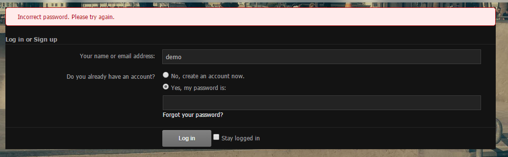
Notice how Login or Signup is all the way into the border, i assume it should have some padding / space between it?? (
http://i.imgur.com/VGBc4v6.png )
Administrator
Staff member
Customer
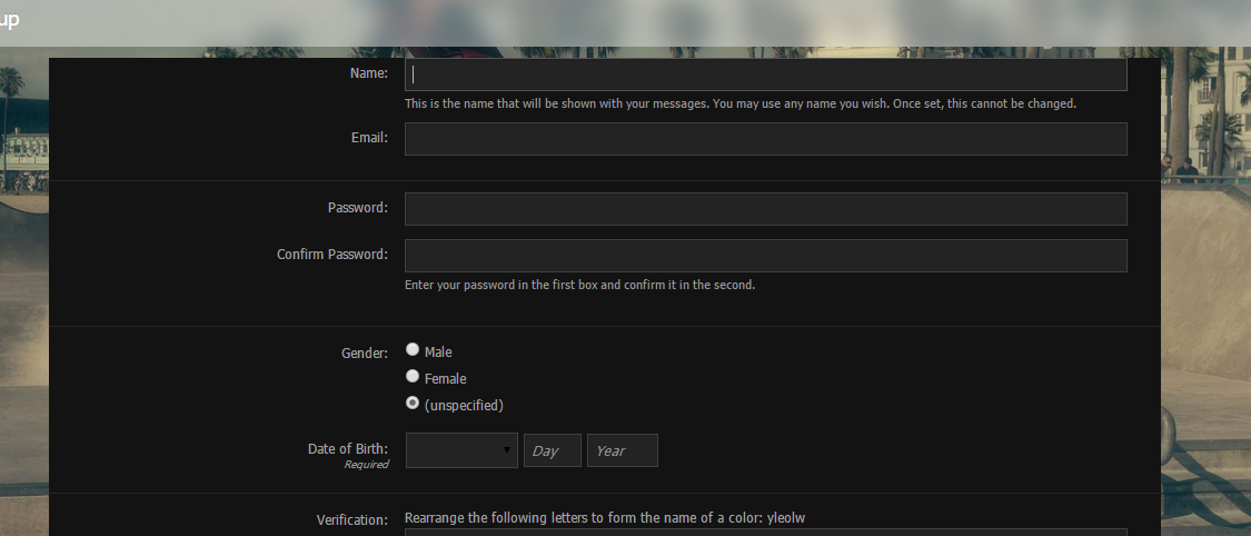
also register page has wrong padding.
Administrator
Staff member
Customer
Fixed too
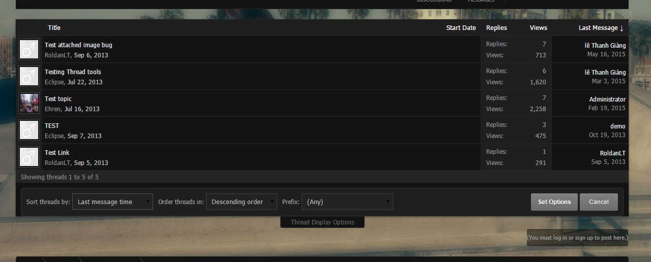
thread display options expand looks like it doesn't have enough space
buttons, is this normal? they are nearly breaking the button (no space or padding.. idk looks weird)
expand button looks weird aligned
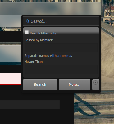
and not to forget that this looks very ugly, i assume its a bug
the gradient
which also appears when threads are closed
Fixed too
i replied more bugs